Tuesday, June 29, 2010

Design OBSESSION- Lee Kleinhelter


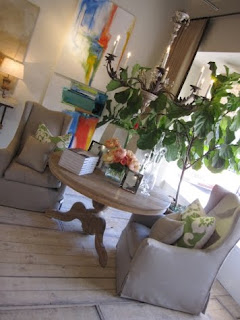
I was "leafing" through the new issue on Lonny Magazine today and fell upon this double spread on Atlanta designer Lee Kleinhelter. The two spreads of her work show a her condo at the Sovereign and one that she designed as a model. Ok, I know this sounds crazy, but I swear this woman is reading my mind. I wish I could meet her and bring her to my new house so she could help me! Mainly, that in the show condo, I am LOVING the color scheme.

Now, Those of you who have been to my apartment understand that I clearly have a slight fear of color in my decor. I have been a wallflower until now with VERY muted colors and a very monochromatic palette. Well, fear not friends, I'm going to branch out. Ok, I'm going to try. I'm really loving the "griege" look with a touch of hot color. Read: Orange, Yellow, or Lavender. Really, are there any better colors in nature? Pink Maybe?

Loving these headboards upholstered in Tangerine Felt from knoll.com


I loved her use of orange touches with a chocolate color anchor. I feel that it could appeal to a variety of different people, whether their taste is classic, trendy, or modern.


Next, you see her own condo at the Sovereign, which is FABULOUS. She made a good point that she wanted to keep the bedroom neutral. I couldn't agree more. I think the bedroom needs to be a very calming place.

Ok, More reading my mind. I am LOVING vintage chairs, painted white and upholstered in navy. Such a FAB color combo, since most people would expect black. I need some for the dining table, which as I've mentioned is a distressed wood farmhouse table. I know I'll end up with vintage one's and would really like to end up with either chippendale chairs, something french, or something Hollywood Regency inspired. Her Louis XVI chairs and a simple navy fabric are perfect and simple.


I've never been to Atlanta, but I hope to meet Mrs. Kleinhelter someday! We clearly have similar design philosophies!

All images courtesy of Lee Kleinhelter and Lonny Magazine

Friday, June 18, 2010

Life Decoration..... Dining-Ware


House Beautiful via Style Redux Blog


I have a female disease. One that I probably inherited from my mother. I'll call it china-holic-itis. The love/addiction to/ and general need for lots and lots of beautiful dining-ware! I can wonder around in Anthropologie, Williams-Sonoma, Neimans, and Pottery Barn for hours on end, just fawning over their dinnerware, flatware, and glassware. As of right now my kitchen cabinets house plain white dinner plates, a few vintage pieces, assorted colorful bowls and tons and tons of glasses. Really, it's an addiction.

Here are some of my new faves from Anthropologie. What did we do before that store?

These latte bowls are amazing. Cereal, Soup, Ice Cream....Whatever. Very french.... All different colors.

I actually bought these ikat bowls last year. Two orange, two green. My mom gave me my grandmother's china from the 60's (yes, I was THRILLED!) which is white with a gold scalloped rim, so I thought they'd give a modern touch to that!

LOVE these beveled tumblers. They're acrylic to ward off breakage, but so chic.


When I register, whenever that may be, I want tons of white everyday dinnerware. I just love it, and it's my personal opinion that food just looks/tastes better on plain white plates. These designs are from Pottery Barn. Which is your fave?

Also when I register, I want this Alton Flatware from Williams-Sonoma. It's handwash only, but since Brian and I have a deal ( I cook, he cleans.) I think I'll be ok. I love how french it is. Gorgeous burnished pewter handles, I'm sure they'll just get more beautiful with age.

SO. Let's picture my perfectly set, everyday dining table. Farmhouse distressed wood table, Hemstitched Pottery Barn Cream Linen Runner (see below), Round Hemp Placemats (very similar to those below from PB), Cream/Gold Scalloped Plates, Ikat Bowls, Alton Flatware, and Beveled Tumblers. Perhaps some Mint Julep Cups (sb) for water. Thoughts?

I made this Recipe tonight. Real Simple is my favorite source for recipes. If you ever need a great one, go to the website. Salad Nicoise is a pretty traditional dish, but usually paired with tuna. The salmon version is equally delicious. Great for when you want a light meal. Brian LOVED it. Trump was jealous.

Salmon Nicoise Salad

Serves 4Hands-On Time: 15mTotal Time: 30m

Ingredients

  • 1 pound new potatoes, scrubbed
  • 1/4 cup mixed chopped herbs such as parsley, chives, or dill
  • 1 tablespoon Dijon mustard
  • 1 tablespoon fresh lemon juice
  • 1/2 teaspoon kosher salt
  • 1/3 cup plus 2 teaspoons olive oil
  • 1 large head Boston lettuce, leaves washed and dried
  • 1/4 pound cooked green beans
  • 2 6-ounce skinless salmon fillets
  • 2 hard-cooked eggs, cut in half
  • 1/4 cup nicoise olives (2 ounces)
  • 1/4 teaspoon black pepper

Directions

  1. Place the potatoes in a large saucepan of water and bring to a boil. Reduce heat, cover, and simmer until fork-tender, about 15 minutes.
  2. Meanwhile, heat the broiler. Coat the salmon fillets with the oil and season with the 1/4 teaspoon of the salt and the pepper. Broil 10 to 12 minutes, until just cooked through. Let cool, then flake with a fork.
  3. Whisk together the chopped herbs, mustard, lemon juice, remaining oil and salt in a medium bowl. Set aside.
  4. Remove the potatoes from the pot and cut them in half when they are cool enough to handle. Arrange the lettuce, potatoes, and green beans on 4 plates. Top each with the salmon, eggs, and olives. Drizzle with the dressing and serve.
By Kay Chun, September 2002

One last thing....

Congrats to my friends Katie and B.J. who got engaged this afternoon in the wine country outside of San Francisco. The most precious high-school sweethearts I have ever had the priveledge of knowing... I know you two will be deliriously happy together. Love ya'll!

Thursday, June 17, 2010

Design OBSESSION- Thomas Paul


One of the things I love about design is how the smallest things can inspire you and lead you down an unexpected style path. I went to Vintage Living in Snider Plaza in Dallas today and bought myself a Thomas Paul notebook for work. It's so darling, orange and white, and matches the mousepad I got a few months ago. Now that I had made my second Thomas Paul purchase, I was curious as to what other treasures he might have in store. Thomas Paul is from NYC originally (so jeal Thomas!) and his company started with neckwear designs and eventually morphed into pillows in 2001.

chairs photo via thomaspaul.com

Although you can't purchase his designs on his website, you can see an extensive view of his decor collection. It is FABULOUS. Thomas Paul seems to be in good company in the newest wave of decor; a mix of retro, Hollywood Regency, Asian, Moroccan, French, and of course lots and lots of COLOR.


Love these pieces from Thomas Paul.


This pillow from Thomas Paul would be PERFECT for my new guest room. We're doing a Nautical meets french flavor and I would love to add this to the bed or a slipper chair.

Thomas Paul's Designs remind me alot of Jonathan Adler, who I adore. I had been fawning over this orange lacquer tray in a recent issue of Coastal Living.

While the tray is gorgeous, and comes in a few other FAB colors, it's a tad out of my price range. This lacquer tray from World Market is current on Sale for $12.00. Much better!

couch from Quatrine


I am loving COLOR right now, although I've been a little afraid of it in the past. I think the best avenue for a color beginner like myself is to decorate with mostly neutral larger pieces (i.e. couches, chairs, tables, etc.) and use color on items that can be easily changed (pillows, trays, rugs, curtains, etc.) I love these neutrals!

Thomas Paul designs can be purchased at a host of retailers, including one of my favorites, Anthropologie!

Wednesday, June 16, 2010

Silver Screen Style...... Inspiration from my Favorite Cougars


Cougar Town is without a doubt my favorite new show. I haven't found one I really really liked since Sex and the City and Friends ended in 2004 and it's been a sad six years without a good comedy. I'll be the first to admit that I have pretty sub-par taste in TV and Movies, mainly because my criteria is pretty skewed. I prioritize like this: set design, costume design, entertainment value. Yes, in that order. Fortunately, Cougar Town possesses all those things. I have all the epies recorded on my DVR and I rewatch when I'm happy, sad, sleepy, hungover, lazy, etc.

I love love love the set design in this show. Jules and Ellie both have fabulous homes in the cul-de-sac. I'm probably so into their houses since they both fall into the 1960's Palm Beach Retro Decor group, but in different ways. Jules' house is much more modern and understated, while Ellie's house looks like a fabulous retro doll house, complete with damask wallpaper, a pink/green/white color combo and lots of white furniture.


Love Ellie's House.


If she were a real person, and I like to think Brian and I are alot like her and Andy...( Comon! I can be a little "firm" from time to time and Brian's pretty goofy), that she would have taken inspiration from a room like this one from Elle Decor


Jules house is pretty fab as well, though Ellie's is more my style. I do love Jules' kitchen and bedroom though.


I love the chair and headboard in Jules' boudoir... You can find the real things at West Elm and Restoration Hardware.


Even Grayson's House is stylish.... It's Man-Chic.


video courtesy of youtube.com

One of my favorite recent scenes of Cougar Town....

Tuesday, June 15, 2010

I'M LOVING....Asian Inspired Decor


photo from Elle Decor via chinoiseriechic.blospot.com


Asian Inspired Decor goes way back. Some of it good, some of it bad, and some of it very very ugly. The photo above is one of the room at Ms. Aerin Lauder's abode. God she's Fabulous.

My favorite magazine, Domino (I want to cry everytime I think about it) showcased lots of asian inspired decor, and even used chinoiserie wallpaper to cover their book! (which was gifted to me by my sweet bestie, Miss Lauren)

Right now I'm loving all types of Asian Inspired Decor, Whether it be Fu Dogs, Buddha Heads, or Chinoiserie Fabric and Wallpaper.

Apartment Therapy via chinoiseriechic.blogspot.com

Fu Dogs are something that I really really want right now. They're FABOO. I think I want turquoise one's for the living room. They'll be a great contrast with the orange, mocha, and grey.


bookends from byrdshop.com


bookends from cb2.com

The blue one's are beautiful, but there's always Red......


and Yellow..... These are actually candles from BlissLivingHome.com, one of my fave home sites.


My friend Lindsay (Hi Linds!) told me about these beauties from Target, I think she actually bought them for her APT.

I'm also really into the Buddha heads. Jill and I were in Area on Lover's Lane a few months ago and saw this fabulous buddha head. Isn't it amazing? It's stone with gold leaf painted on the curls. It's pretty huge but would be amazing on a large coffee table or mantle.

For something a little more understated... and affordable, this candle from BlissLivingHome would work too.


My mom would love these Terracotta Soldier Candle from BlissLivingHome